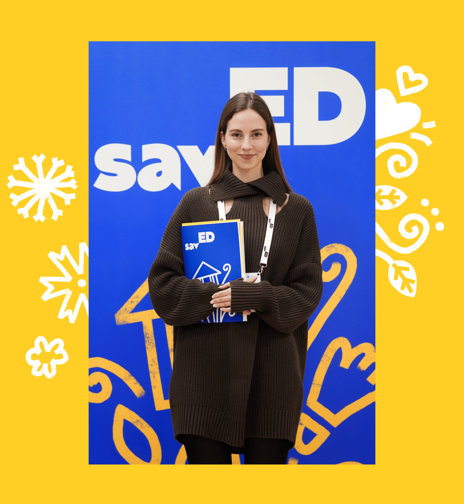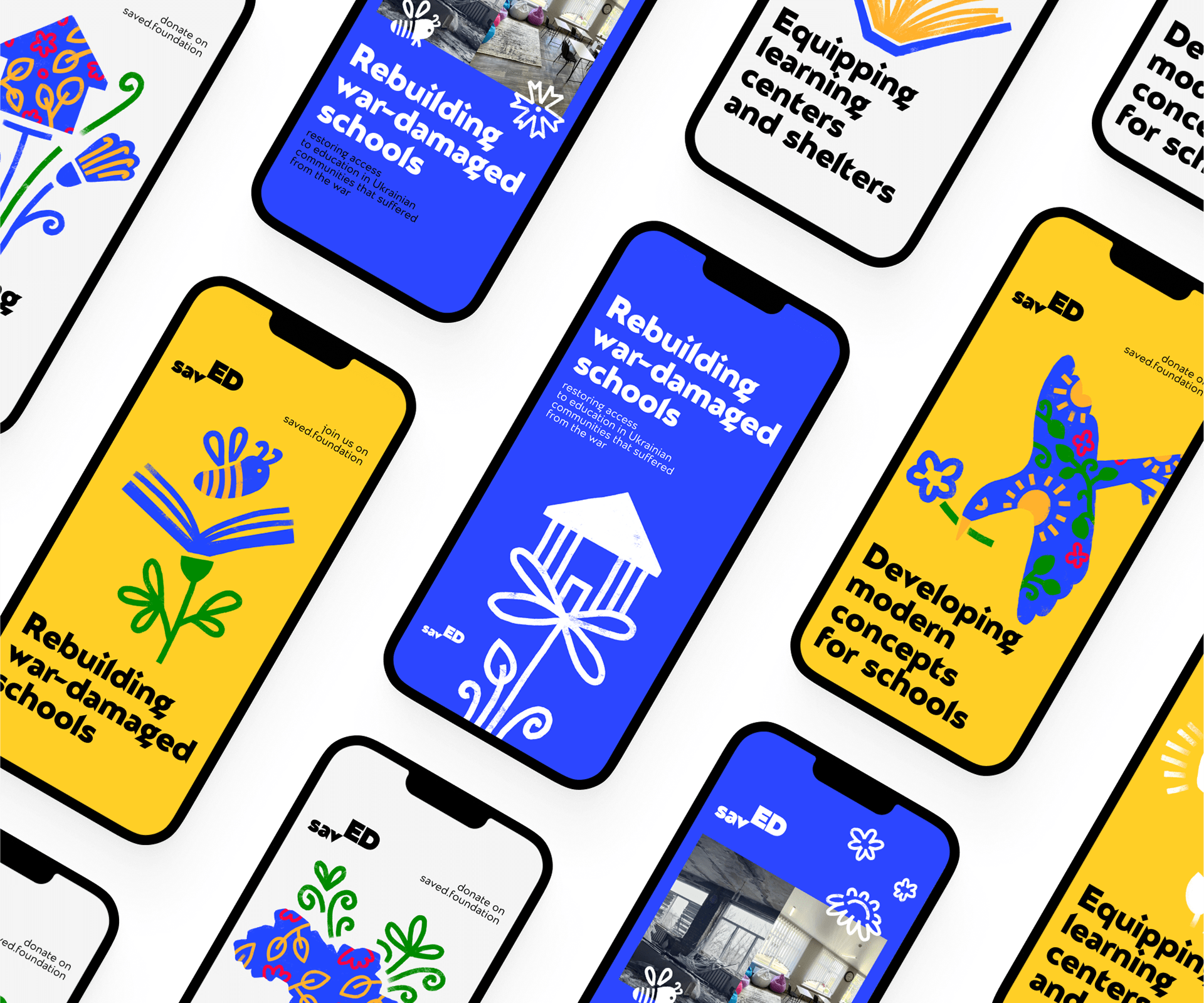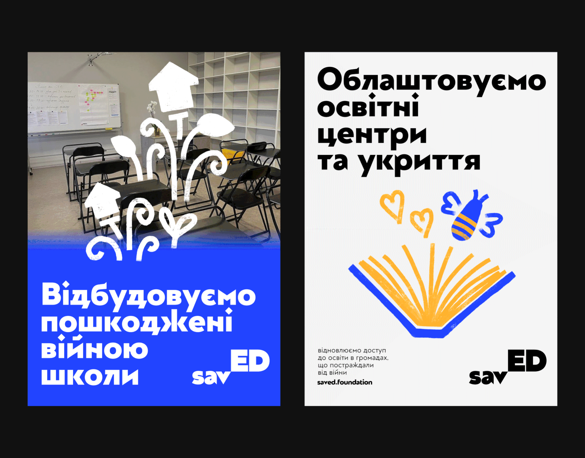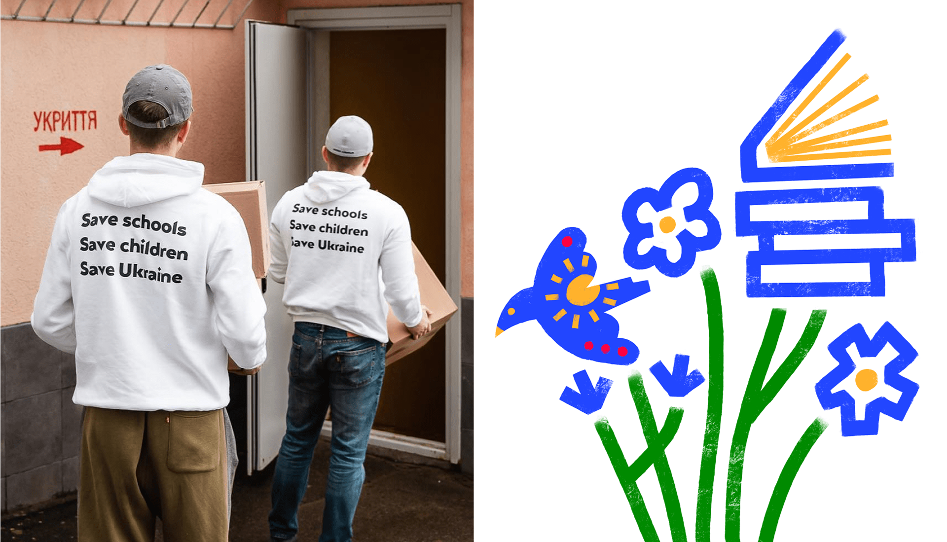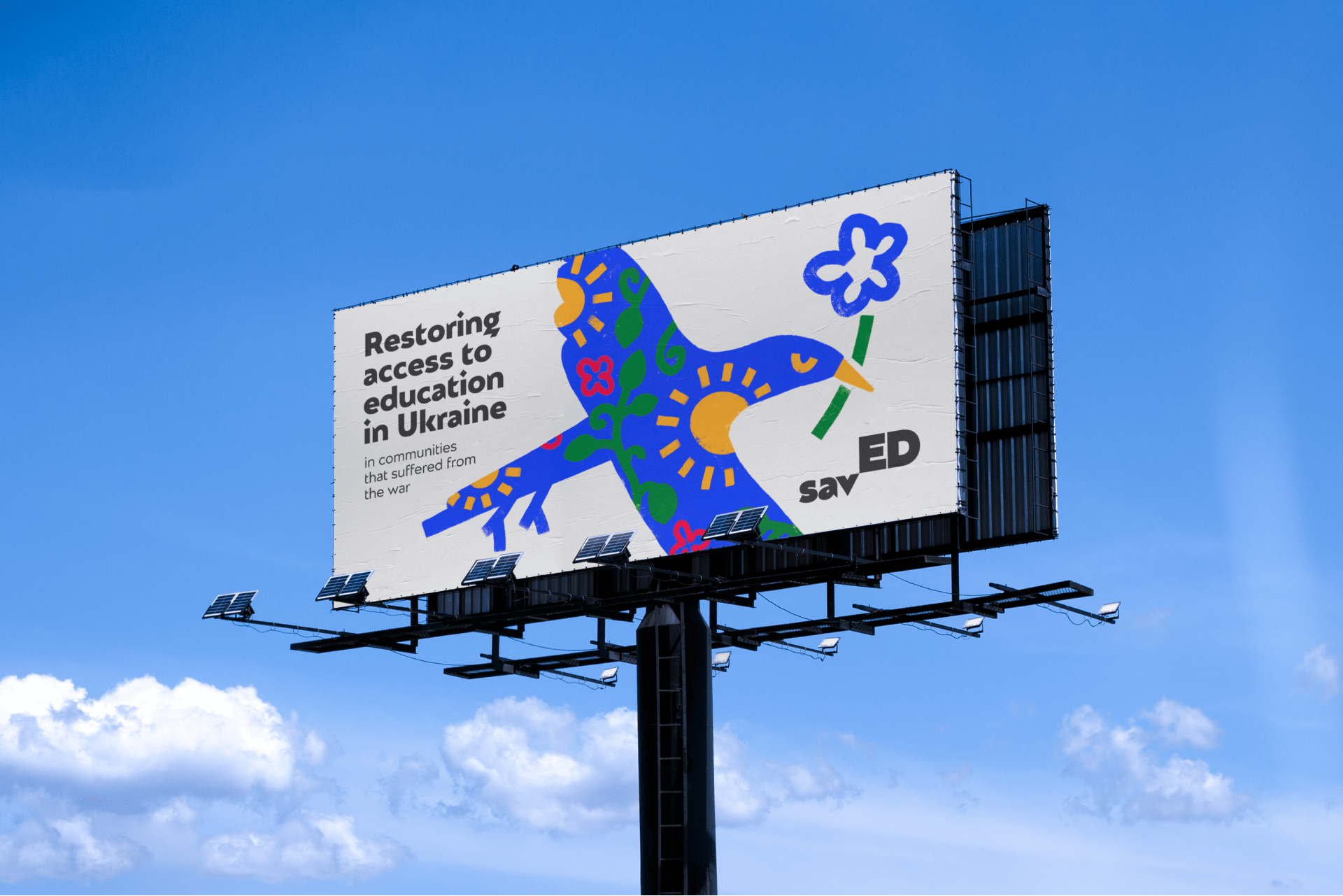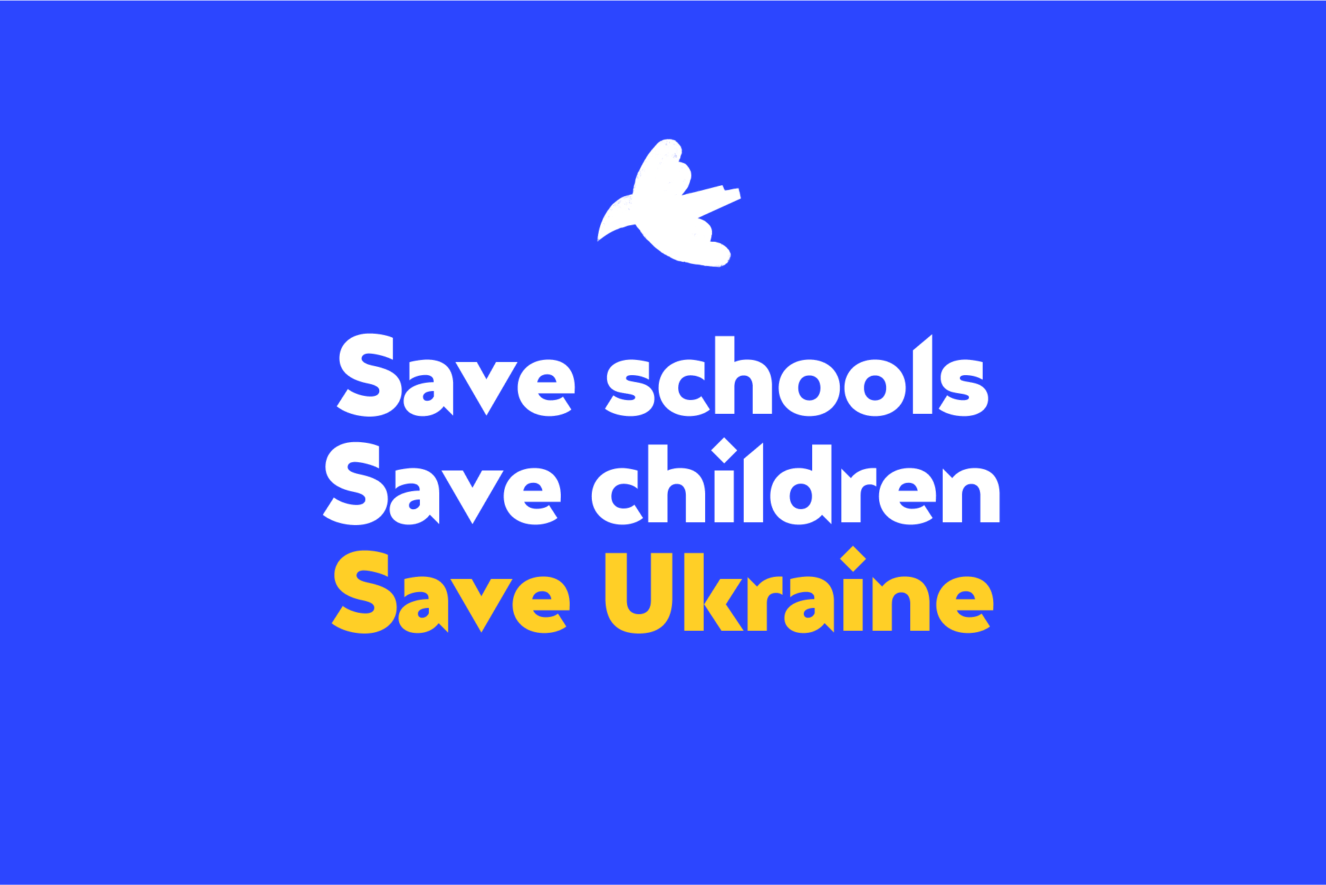
SavED is an international charitable foundation that restores access to education in Ukrainian communities that suffered from the war. Every child in Ukraine should have the opportunity to learn, grow and positively impact their community. The main aim is to provide children with
the necessary tools and resources to study and explore new ideas.
The Objective
Create an identity that evokes empathy without pity. The visual image should effectively connect with foreign partners, donors, and foundations, building trust and forming strong partnerships. At the same time, it should resonate with children and local communities, who are the ultimate beneficiaries.
Design Solution
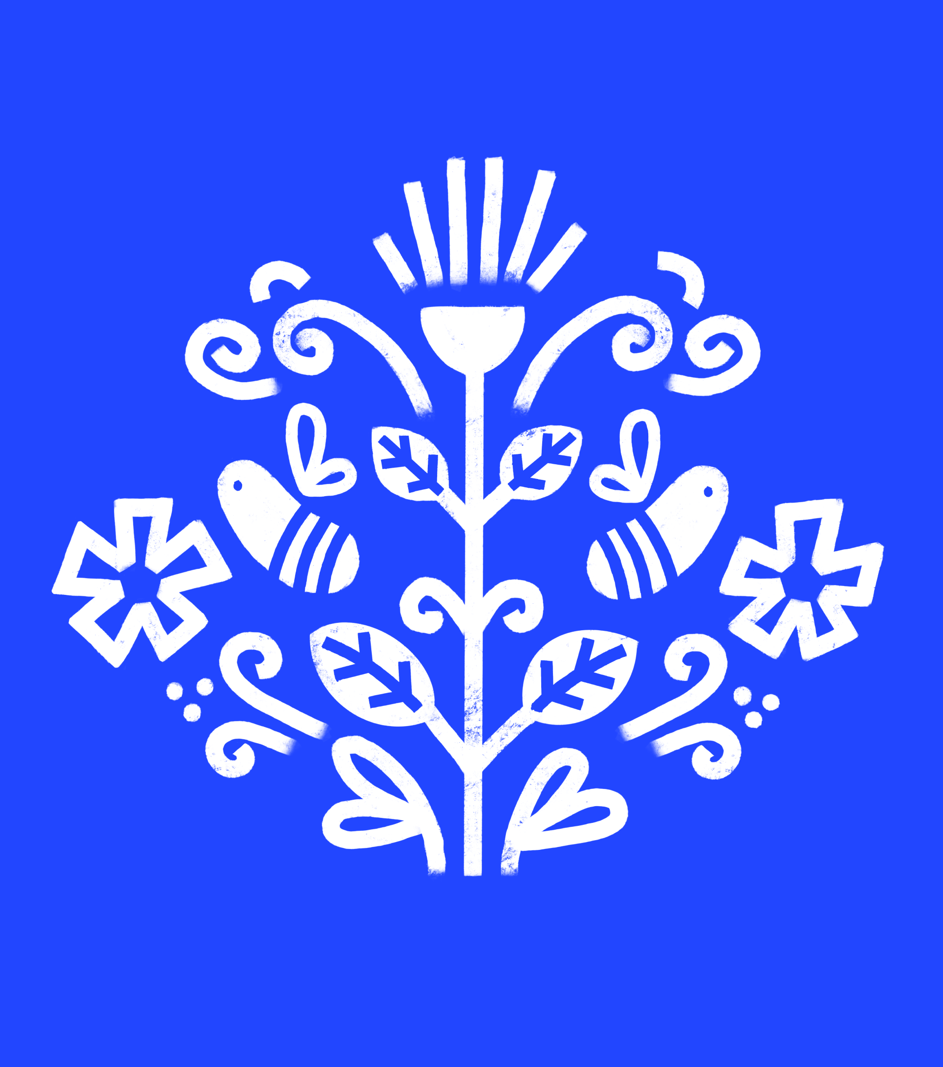
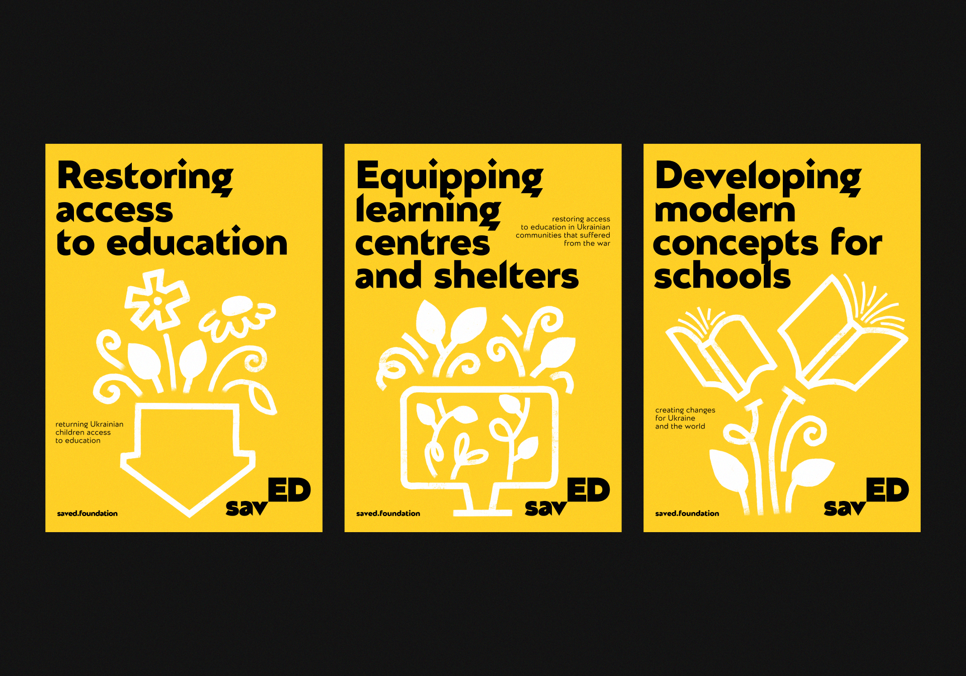
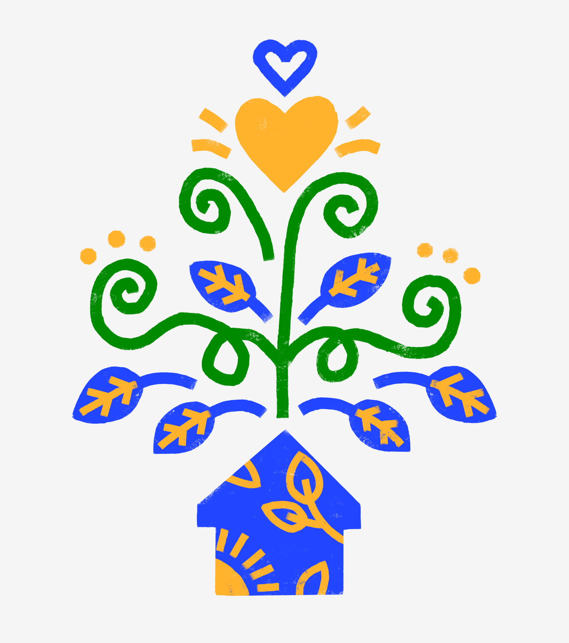
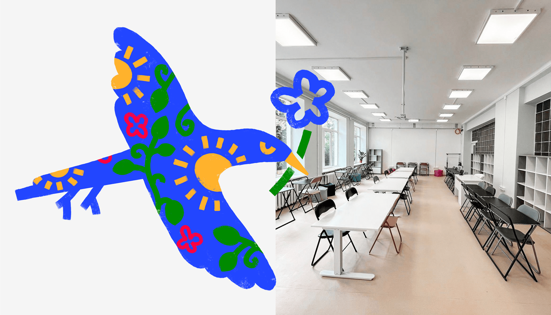
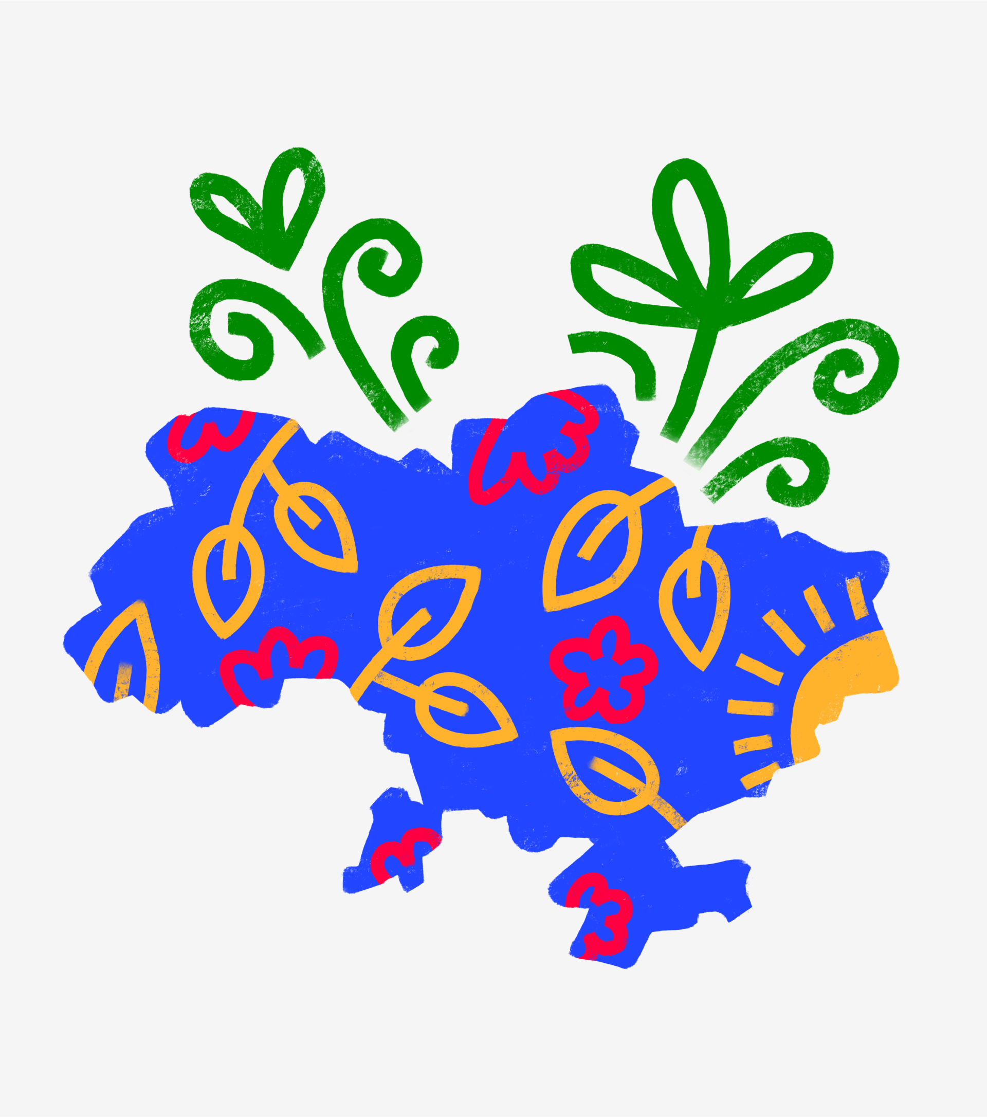
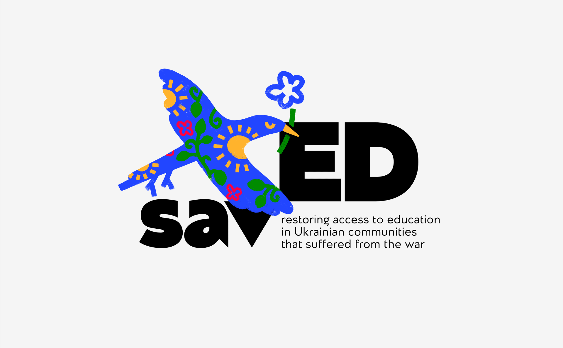
The key design idea emerged from the Ukrainian word ‘життєстійкість’. It means endurance and vitality, eagerness to live and bloom despite all the hardships and sorrow. In times of war, preserving
the desire to live and rebuild the country is crucial. This is precisely what SavED
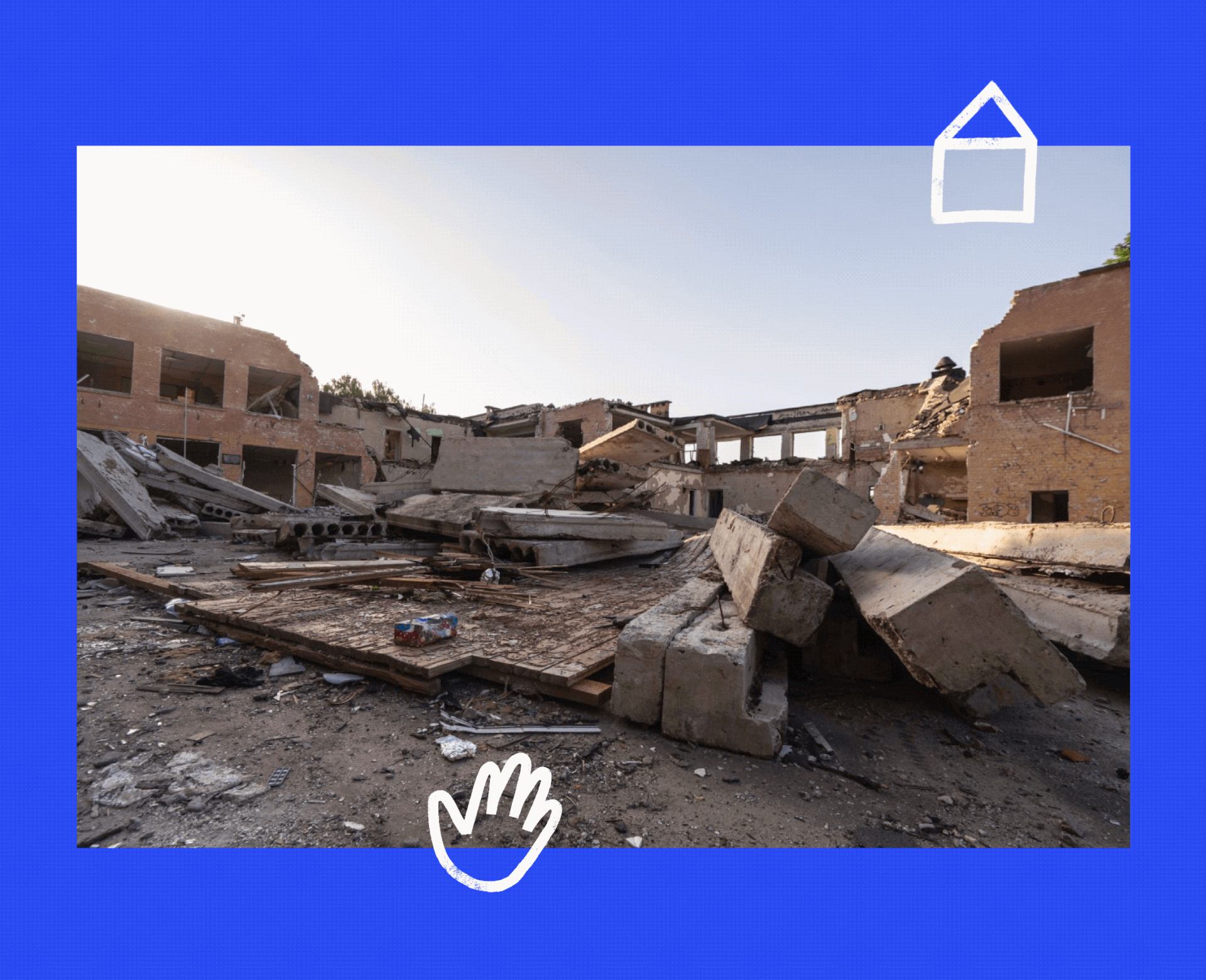
is accomplishing by restoring access to education and rebuilding schools that were damaged and destroyed during the war.
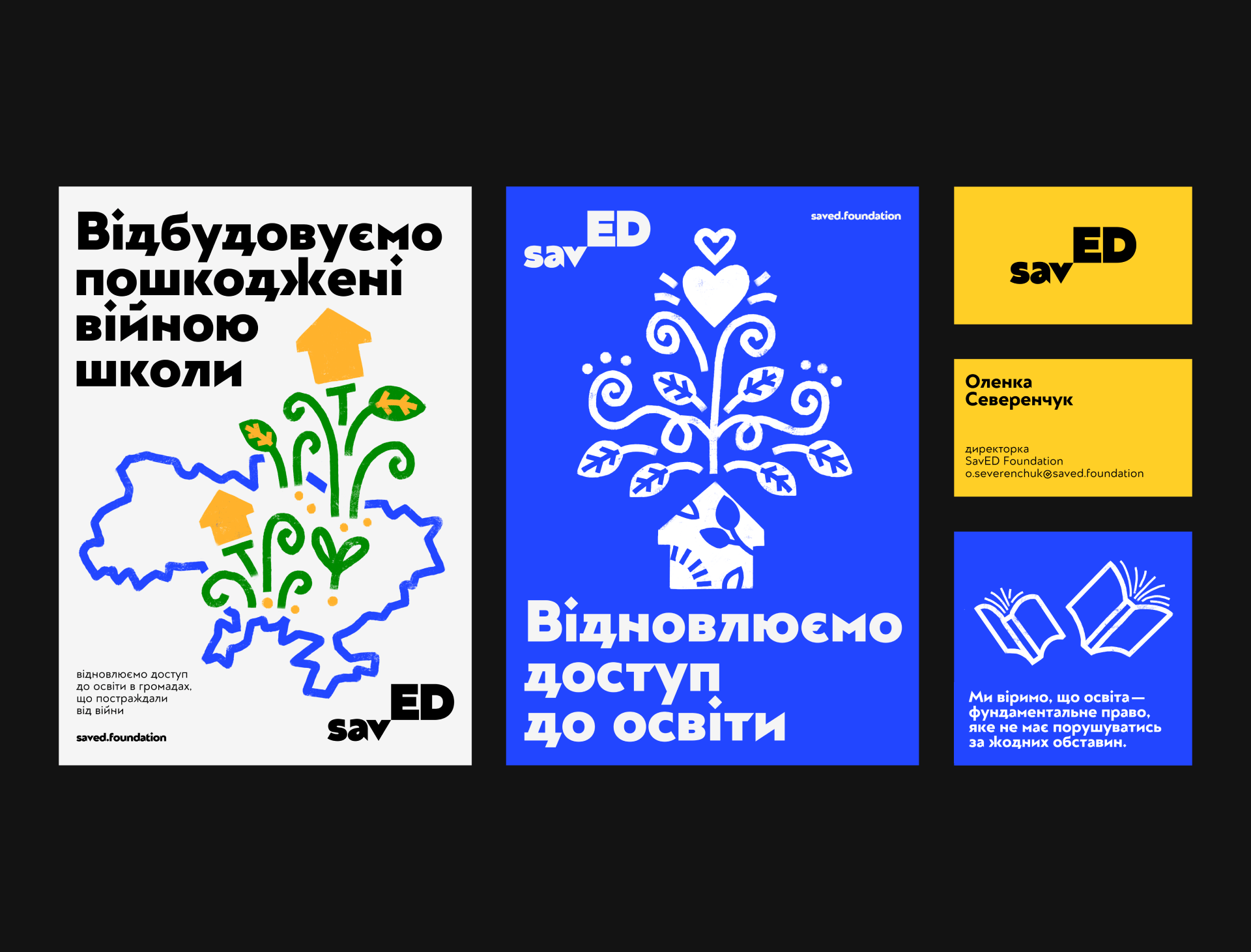
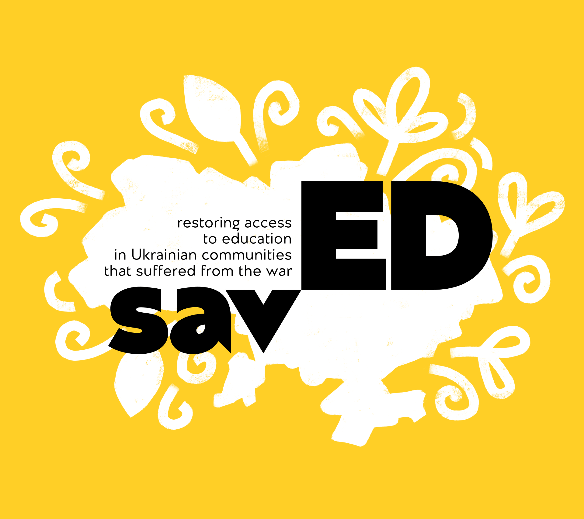
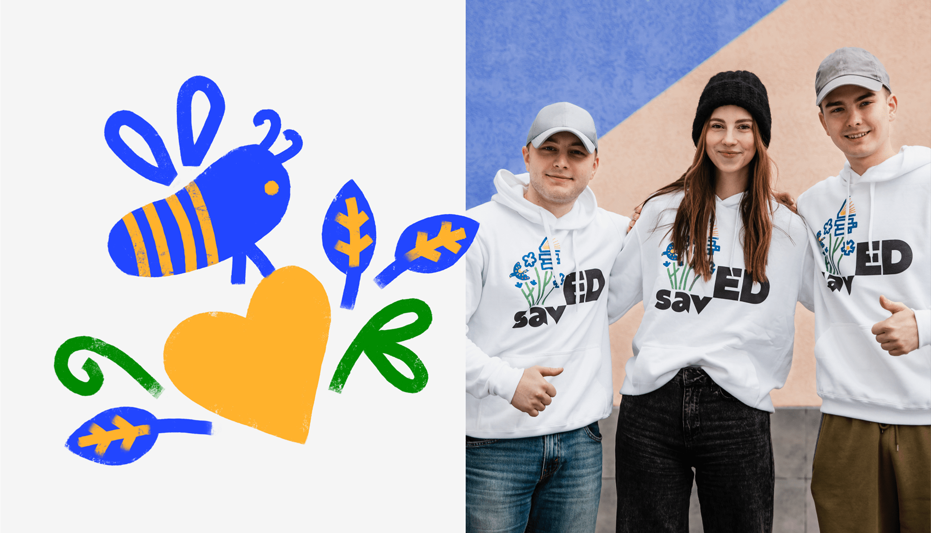
The logo and font reflect the resilient character of Ukrainians and their determination to grow and thrive. We proudly use the Ukrainian font Almaz crafted by Serhii Makarenko & Kyrylo Tkachov from AlfaBravo type foundry.
The logo and font reflect the resilient character of Ukrainians and their determination to grow and thrive. We proudly use the Ukrainian font Almaz crafted by Serhii Makarenko & Kyrylo Tkachov from AlfaBravo type foundry.
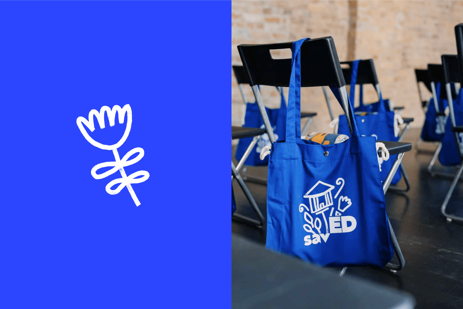
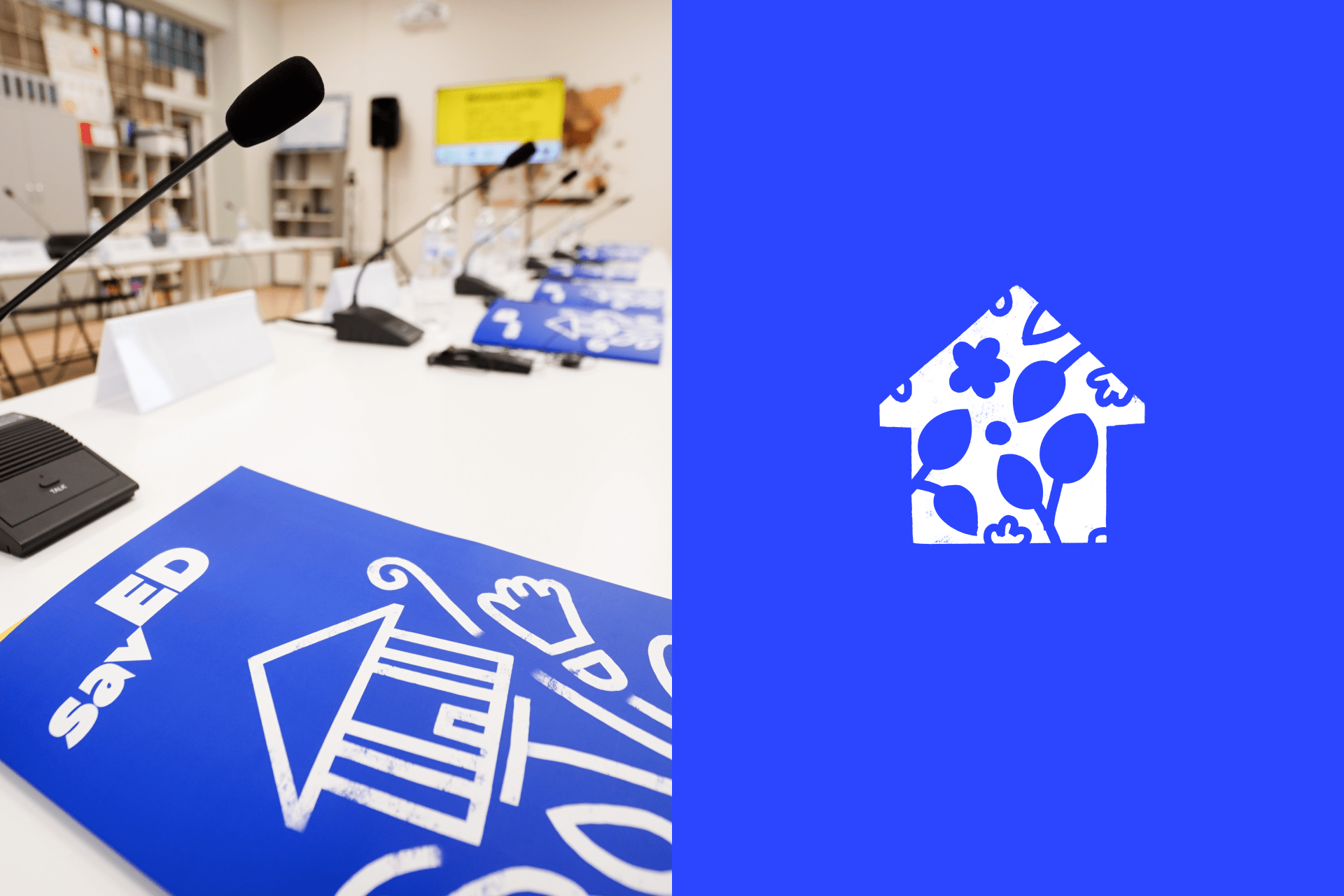
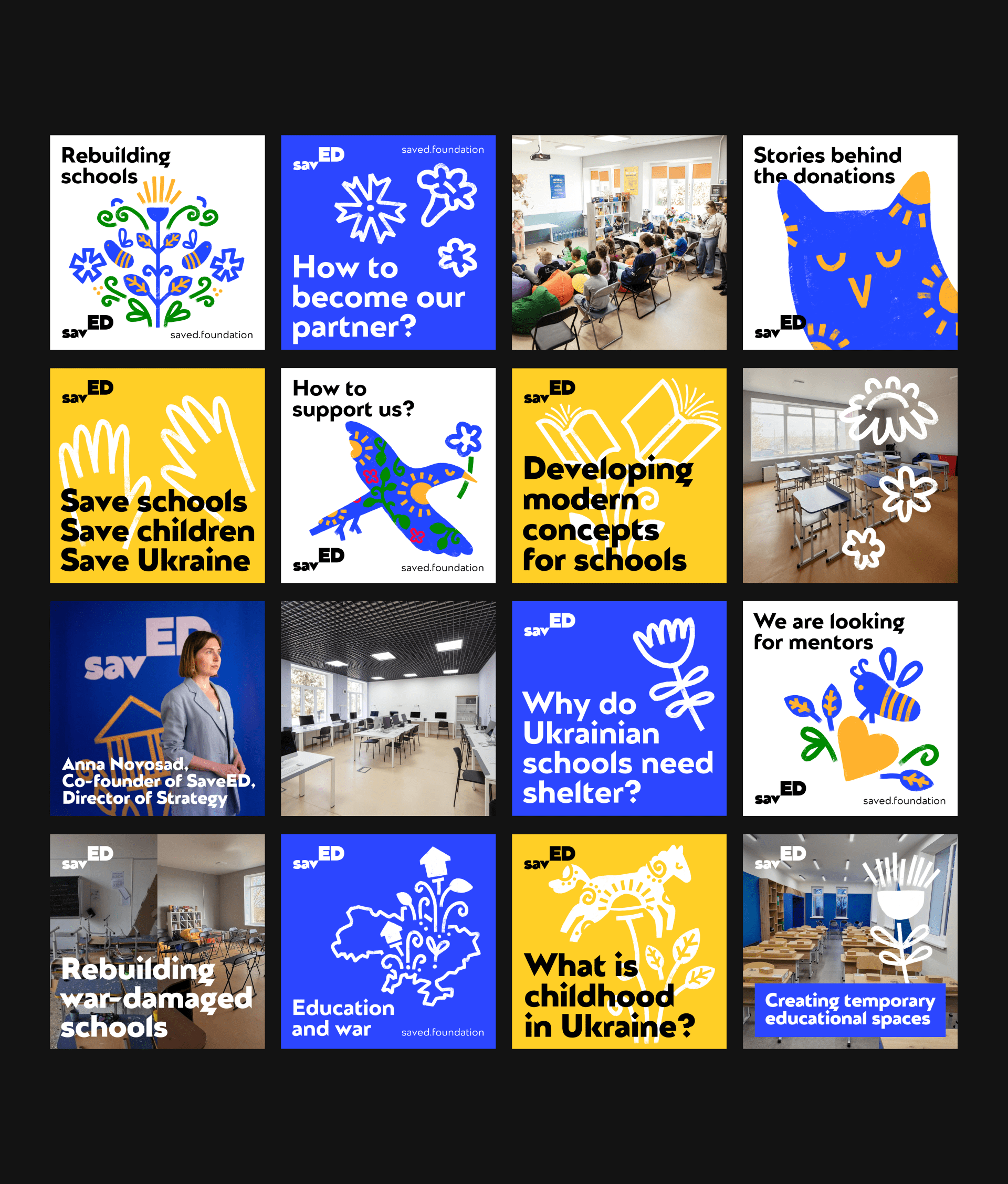
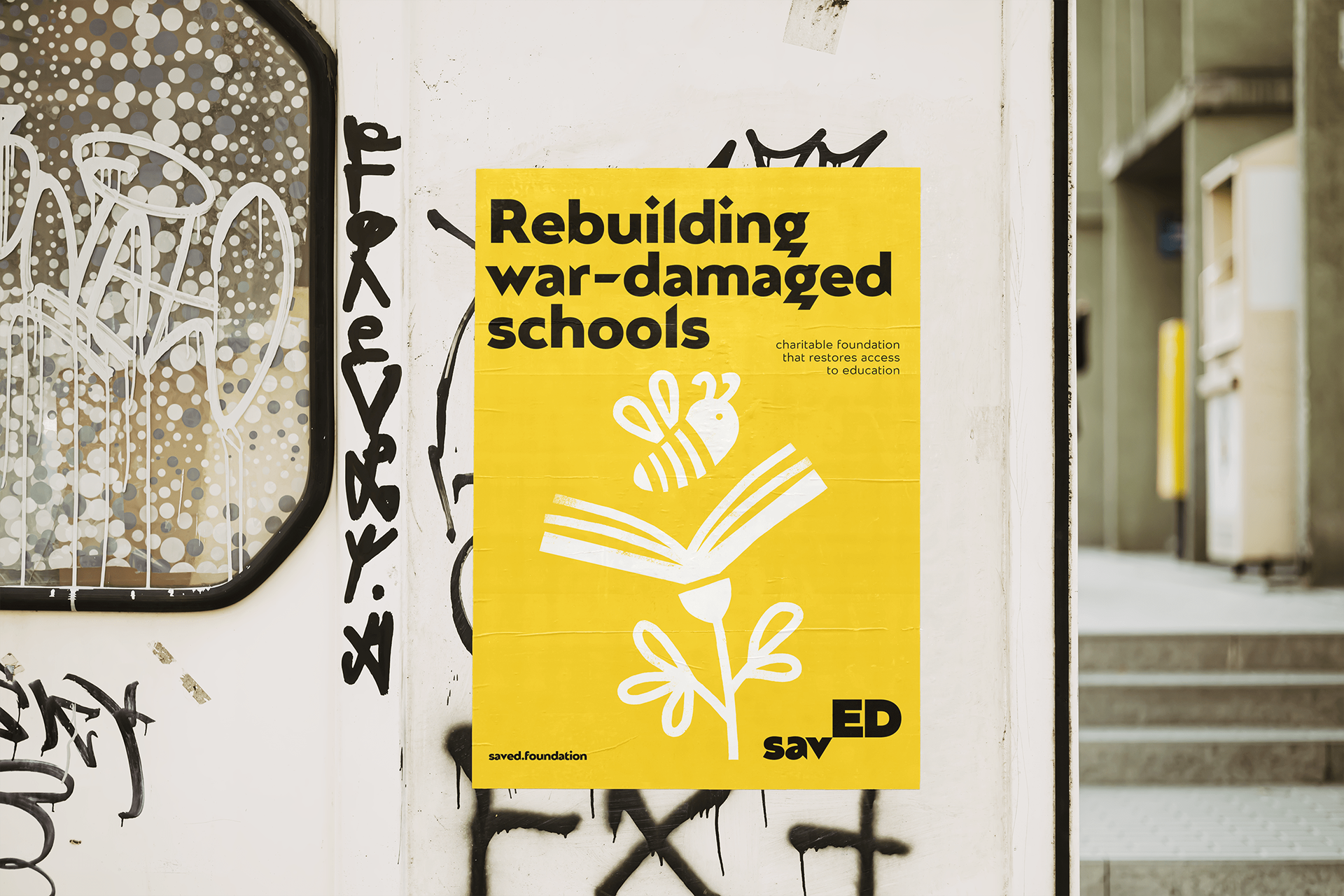
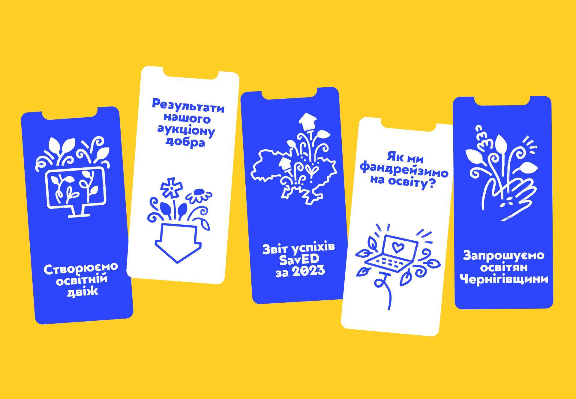
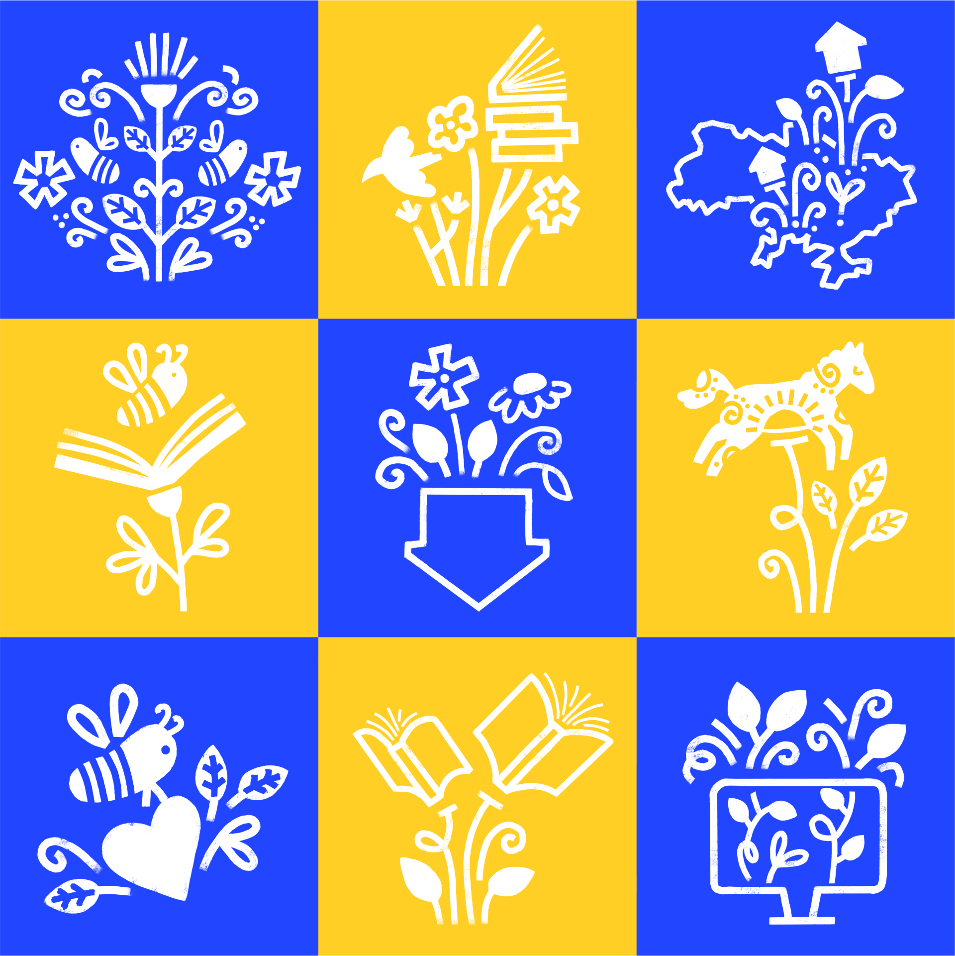
Each illustration symbolises restoration and growth — the core mission of the SavED Foundation.
Team
Concept idea, design & illustrations — Yulia Stroi
Logo design — Anastasiia Shyshenok
Art direction — Glib Kaporikov
Logo design — Anastasiia Shyshenok
Art direction — Glib Kaporikov
Pro Bono design project.
2022-2024